As we walk through life, it’s devotion that enriches our journey. It’s in our commitment to one another and to a higher purpose that we find the true depth of connection. Through acts of kindness, love, and faith, we cultivate something greater than ourselves—a world where hearts and souls are lifted, and lives are transformed.
Devotion shapes us. It is in the quiet moments of faith, in the steady acts of love, where we grow closer to the person we were meant to become. These moments are not fleeting; they are the building blocks of a life filled with purpose and meaning. As we devote ourselves to others and to God, we are enriched—our lives become fuller, more complete, radiating with the quiet strength of a heart guided by faith.
This enrichment is more than personal growth—it’s the thread that binds communities together. With each act of devotion, we inspire others to live with love and intention, creating a ripple effect that reaches far beyond ourselves. We build a world that reflects the beauty of God’s grace, one step, one act at a time.
At the heart of everything we do is a commitment to this devotion. It’s a devotion that seeks to connect, to uplift, and to empower. We are not just living for ourselves; we are living in service to a greater mission, to enrich the world around us through unwavering faith.
In the end, it is our devotion that defines us—not just as individuals, but as a community bound by love, faith, and purpose. Join us as we walk this path together, devoted to enriching each other and the world, through the grace of God.
THE DETAILS
PRIMARY
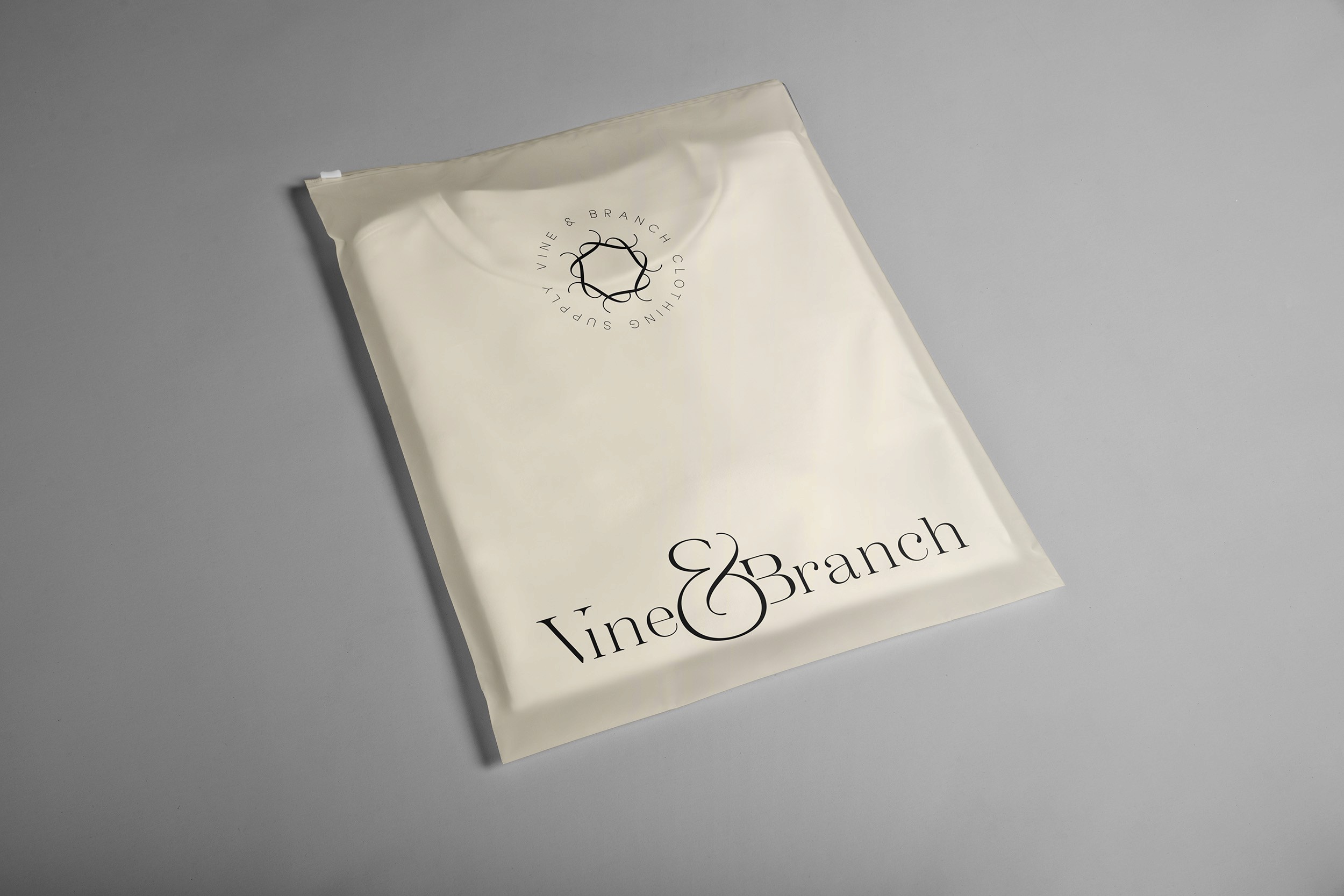
This logo portrays the unity that we inspire and emphasizes the ampersand symbol that acts as the "everything else" outside of ourselves. By giving it the largest emphasis of the logo itself, it speaks to our respect for the ones that are not a direct part of our brand but play a pivotal role in its evolution.
STACKED
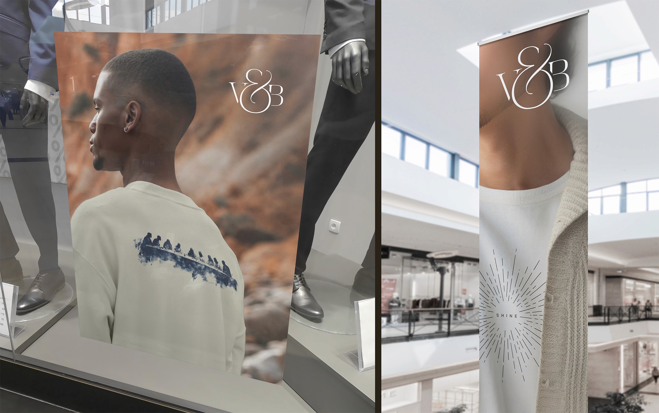
Simplifying the primary logo down to an acronym that still utilizes the same ratio in which it was built, the acronym logo allows for use in established applications and helps reduce redundancies as the brand expands across platforms and mediums.

Mark
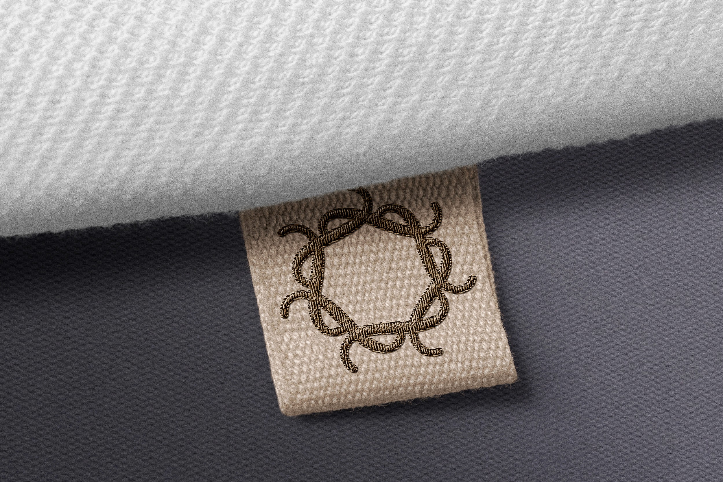
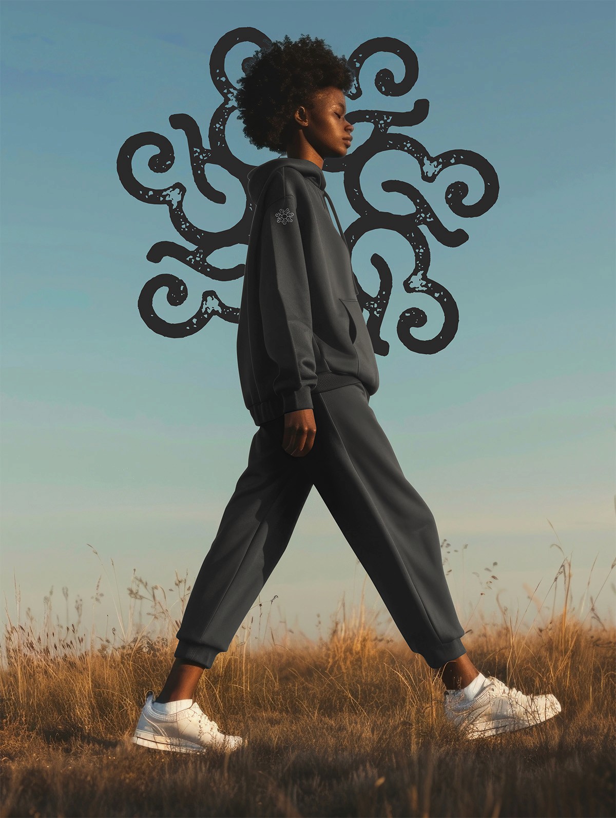
The mark logo strips the arm of the ampersand to create a unified structure of 7 abstract shapes that speaks to the connection between the brand and its community. The use of the mark is loose, providing it the flexibility to scale alongside the brand to provide a fresh look with each new application.

Scotch Display
Scotch Display is the flowing, elegant typeface that embodies the Vine and Branch character and nature as displayed in the logo elements. For all action type, this font provides life and tone that can be matched by the supporting Aloevera typeface.
ALOEVERA
Extra Light
Light
Regular
medium
SEMIBOLD
Bold
Aloevera is the copy to compliment the flowing, elegant nature of the primary brand font, providing superior legibility and complimentary cleanliness to provide an ecosystem of soft and elegant characters.
AURA
soft
humble
inclusive
uplifting
hopeful
Aura is the character of the brand that influences the legacy that it builds over time. By speaking to faith in a humble and soft nature, our brand can build a community of like minds that can spread our mission and vision past our own capabilities. In order to achieve this, we ensure that we always represent in such a way that inspires and excites our community and influences the teaching and word of God.
TAG
love thy.
Vine & Branch is built on the idea that love cultivates positivity. Inspired by the phrase "Love thy neighbor", we've made it abstract and applicable across a wider spectrum. Love thy Self, Love thy Life, Love thy Leader. With Vine & Branch, we invite the avant garde approach to finishing our tagline for us – in a way that applies best to you.
MANTRA
Rooted in faith, grown through grace.
Our mantra is our prayer. It influences our every move and it reminds us why we belong. By remaining true to our roots in our faith for Christ and ensuring that we lead with love, we have the confidence that we are providing the best for our community and influencing a world that our leader planned for us.
In the real world


