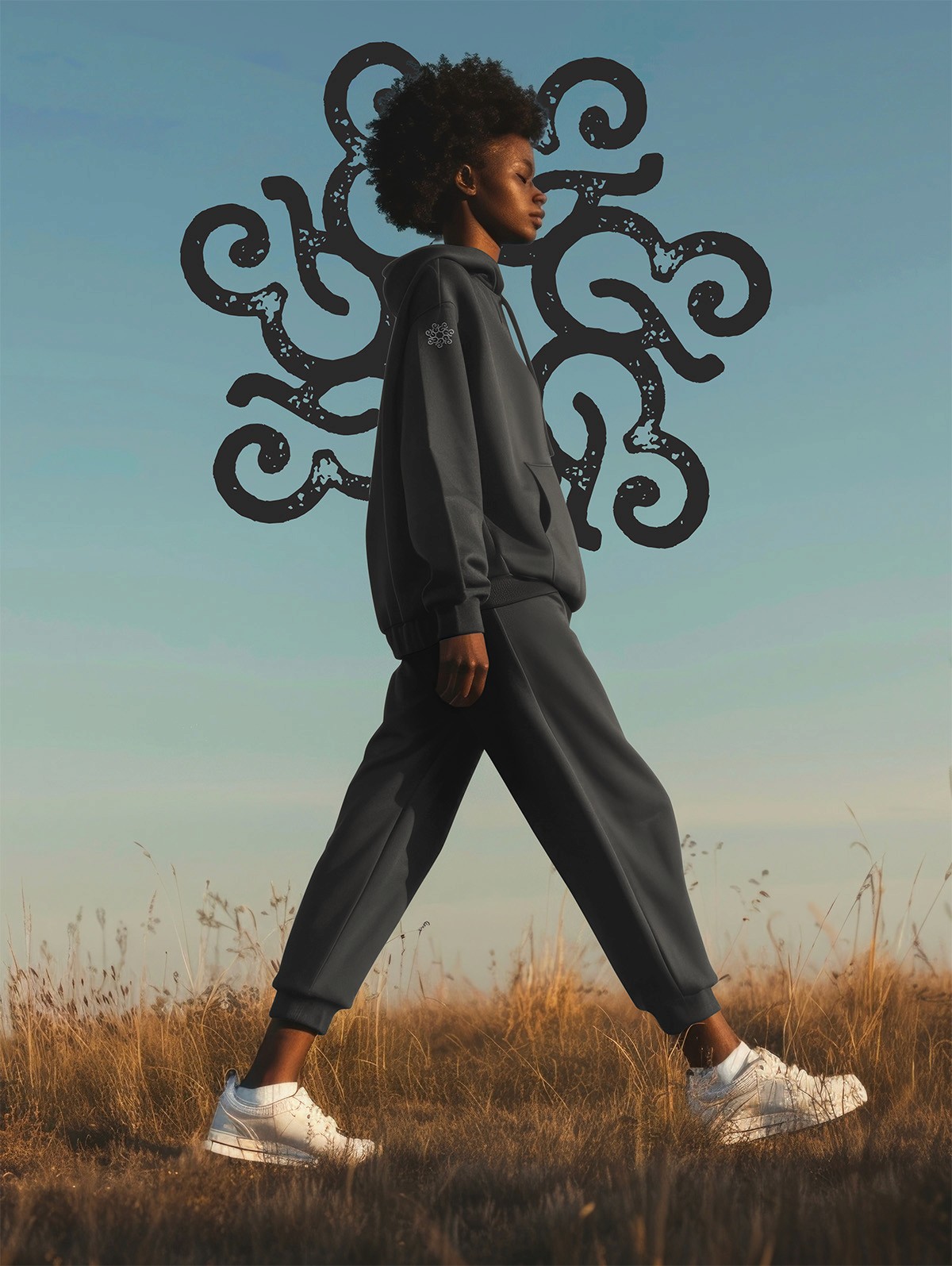
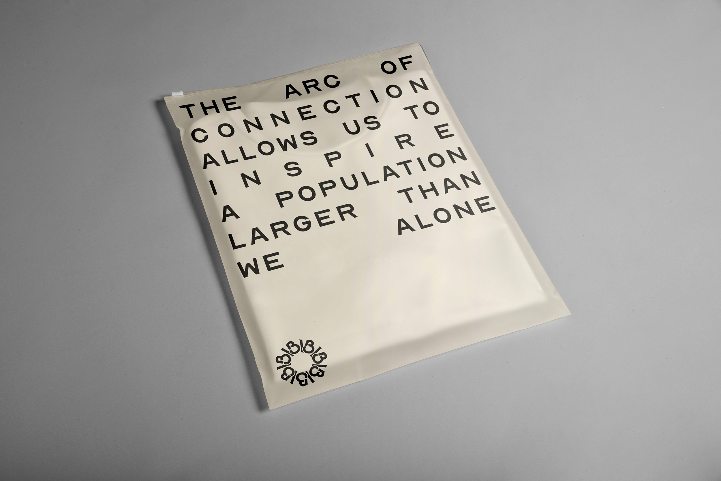
There is a divine arc that stretches across every connection we make, guiding us toward something greater. It’s through this arc that God’s word flows, shaping our lives and the world around us. Each interaction, each moment of faith, is part of a greater purpose—one that transcends the ordinary and brings us closer to the vision God has for us.
This arc of connection is more than just the bonds we form with others—it is the path that leads us to live out His word, inspiring change, love, and understanding. It’s the way we carry God’s truth into our daily lives, allowing it to flow through us into the world. With every act of kindness, every moment of grace, we bend this arc toward something better, something more profound.

At the heart of it all is a belief that through these connections, we can create a better world. A world where God’s love is felt in every corner, where hearts are open, and communities are strengthened. It’s the arc of connection that brings us together, reminding us that we are part of something larger, something divine.
In the end, it is this arc that defines our journey—shaped by God’s word and carried out through the connections we make. Together, we are building a world rooted in faith, love, and unity, one step closer to the vision He has for us all. Join us as we walk this path, guided by the arc of connection that leads us toward a brighter, more faithful world.
THE DETAILS

PRIMARY
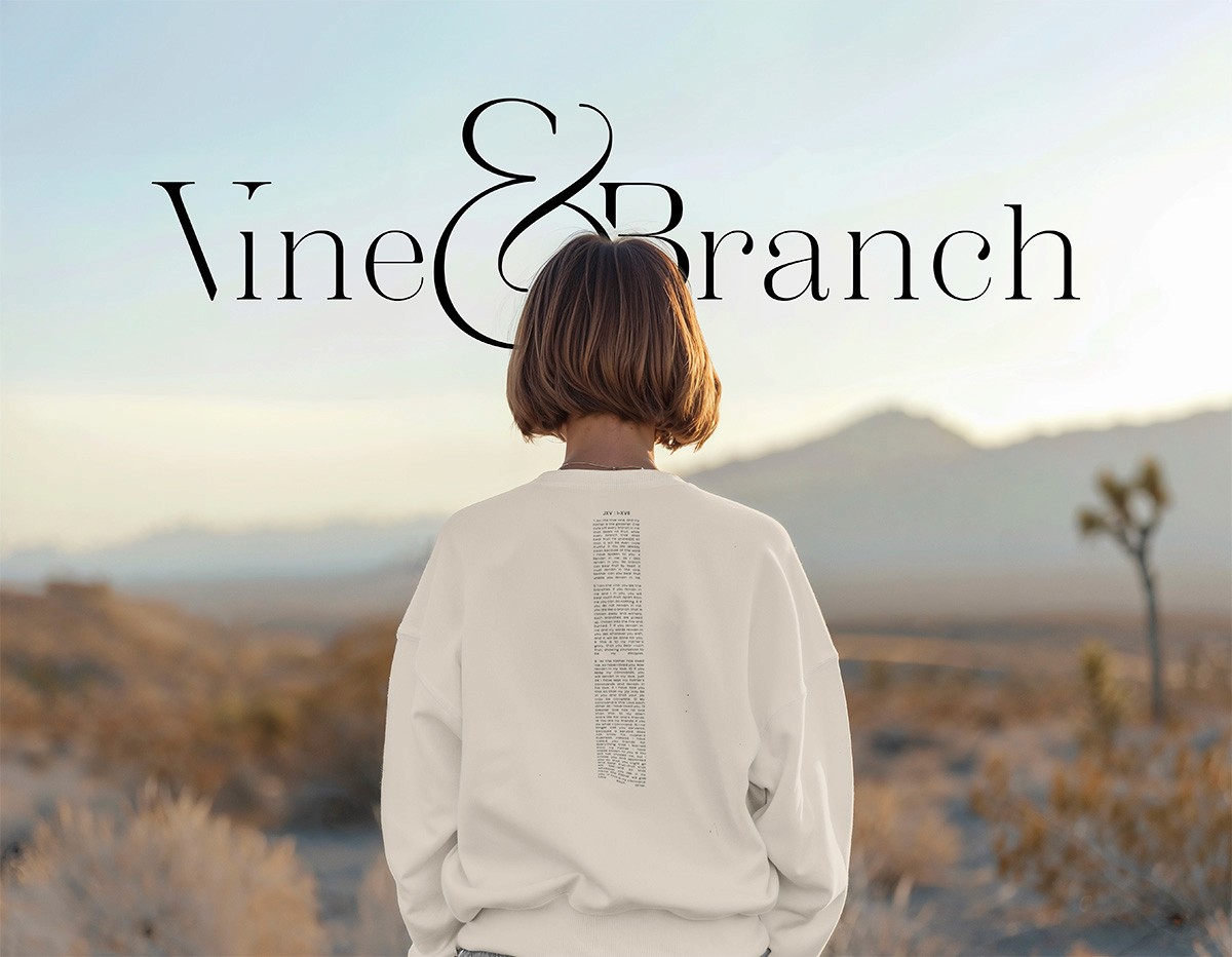
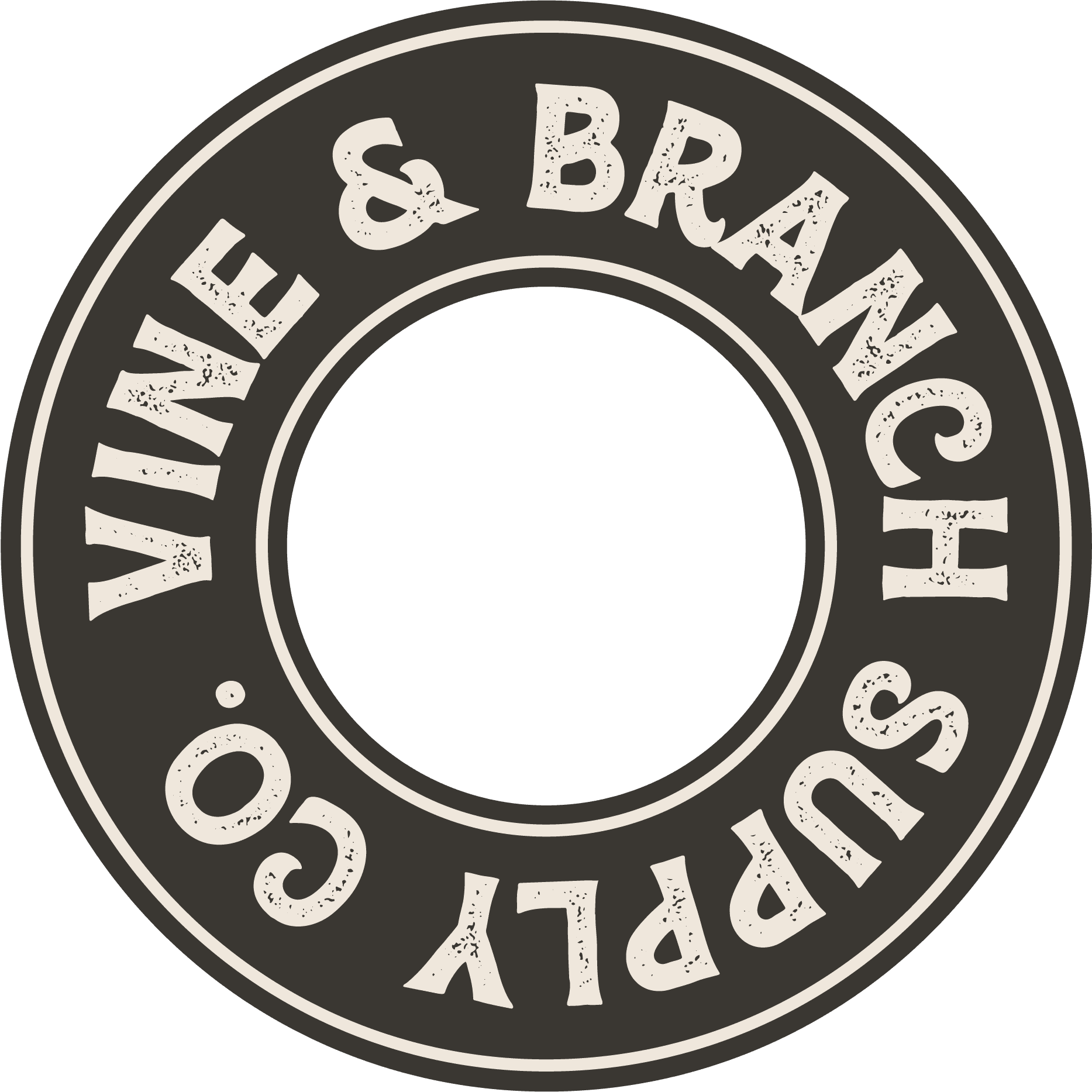
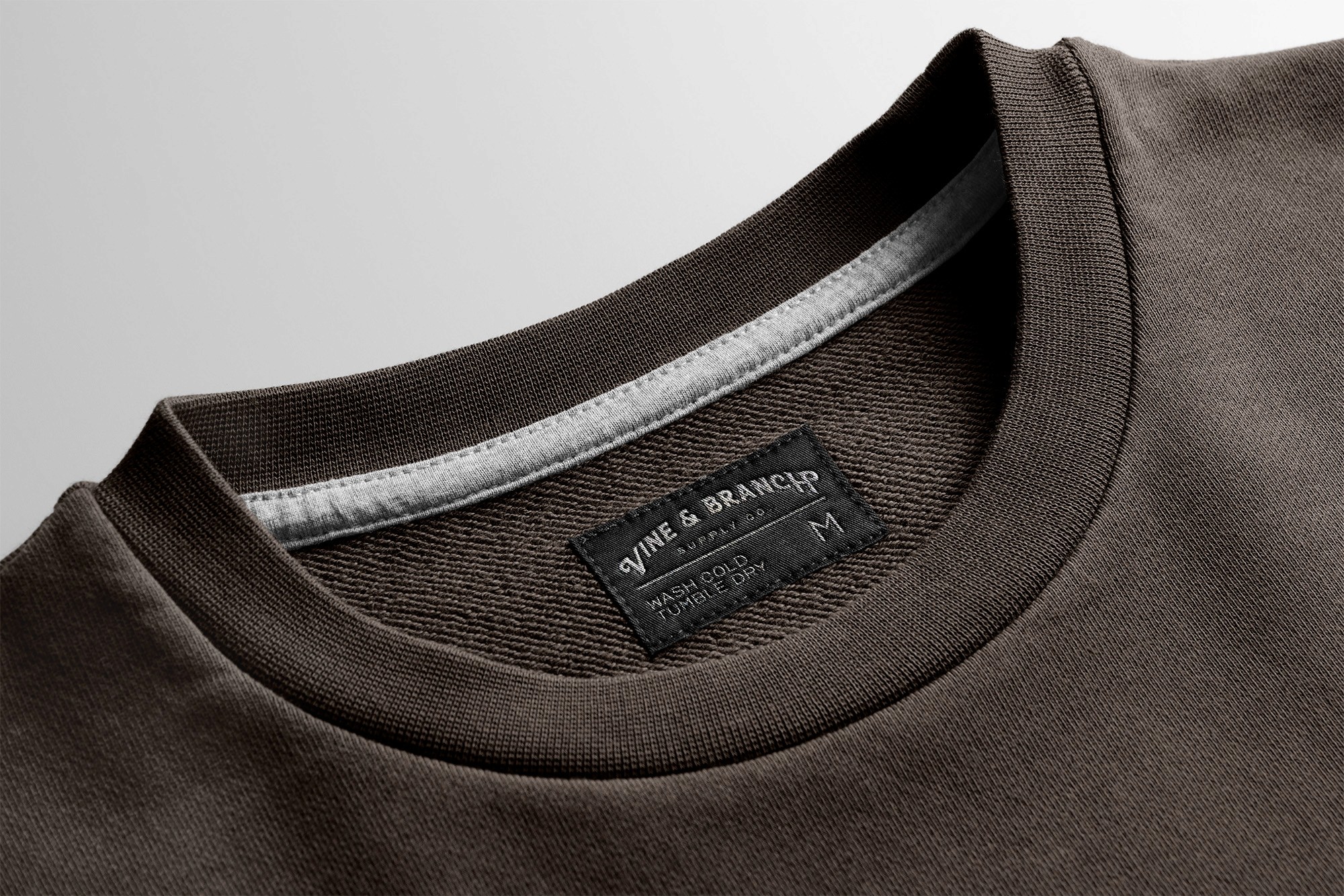
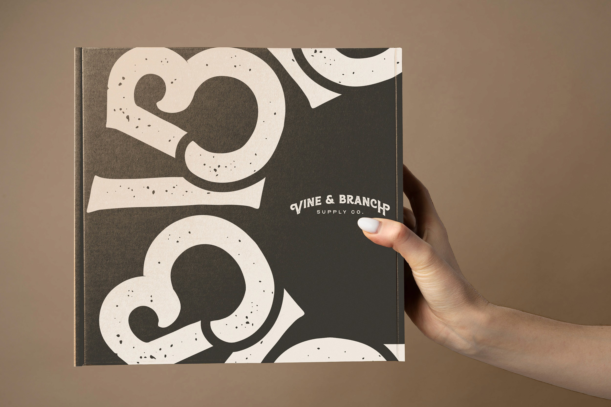
The logo set shown here has been designed to emphasize unity and value through the use of a rich serif typeface that is both emphasized and cut with the ampersand symbol connecting "Vine" and "Branch"
Badge
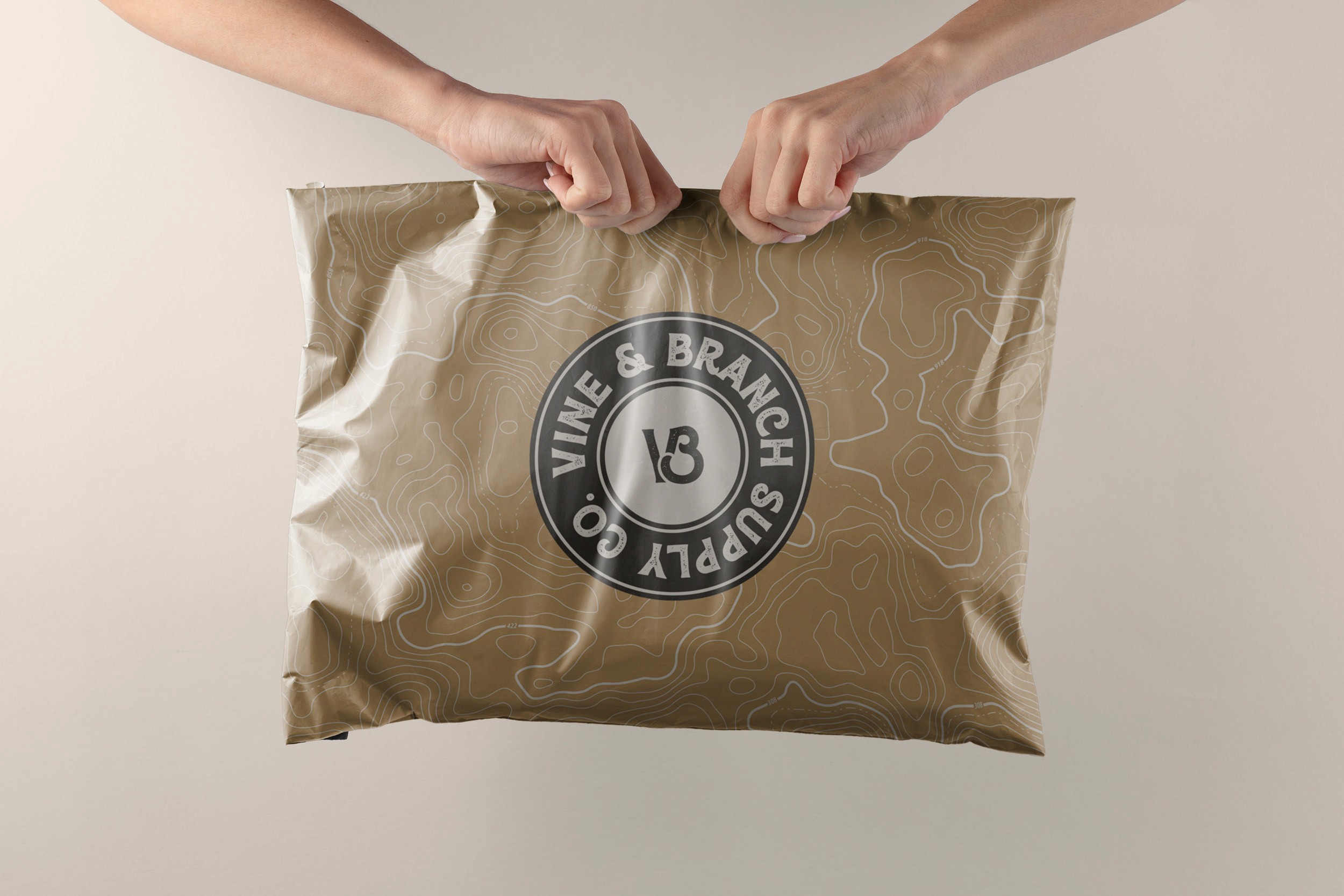
Simplifying the primary logo down to an acronym that still utilizes the same ratio in which it was built, the acronym logo allows for use in established applications and helps reduce redundancies as the brand expands across platforms and mediums.
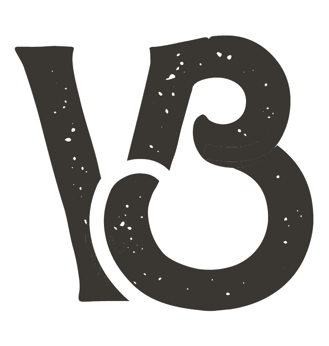
Mark
The mark logo strips the arm of the ampersand to create a unified structure of 7 abstract shapes that speaks to the connection between the brand and its community. The use of the mark is loose, providing it the flexibility to scale alongside the brand to provide a fresh look with each new application.


AURA
raw
bold
alive
inspired
supportive
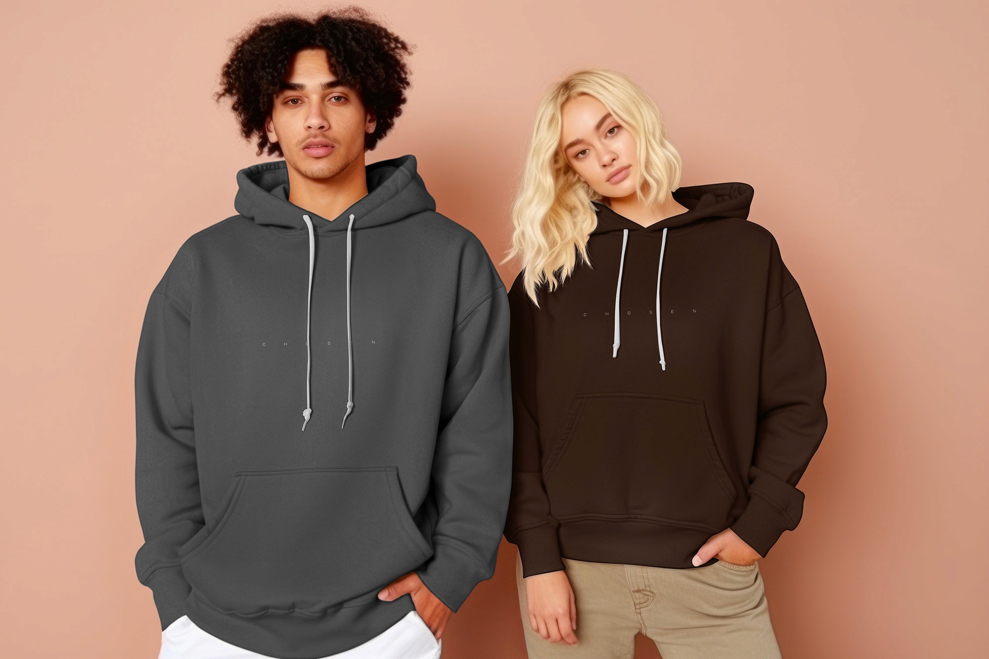
Aura is the character of the brand that influences the legacy that it builds over time. By speaking to faith in a humble and soft nature, our brand can build a community of like minds that can spread our mission and vision past our own capabilities. In order to achieve this, we ensure that we always represent in such a way that inspires and excites our community and influences the teaching and word of God.
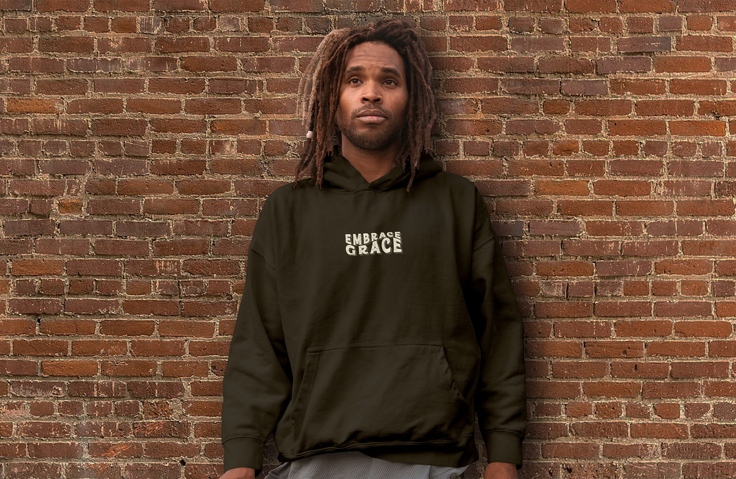
TAG
lead forward.
Our path is carved, and yours is too. That's why we speak with conviction with our tagline to "lead forward" because everything in front of you is planned for you already. Lead with conviction, and show your best self. Together, we will inspire a world that does the same at our side.
MANTRA
guided by him – shaped by you.
Our mantra speaks to each and every person that we connect with. While we are guided by God, our connections shape our reality. This is what inspires us to lead with love and the word of God to ensure that each and every connection is left with an experience that leads us to something better than what we know.
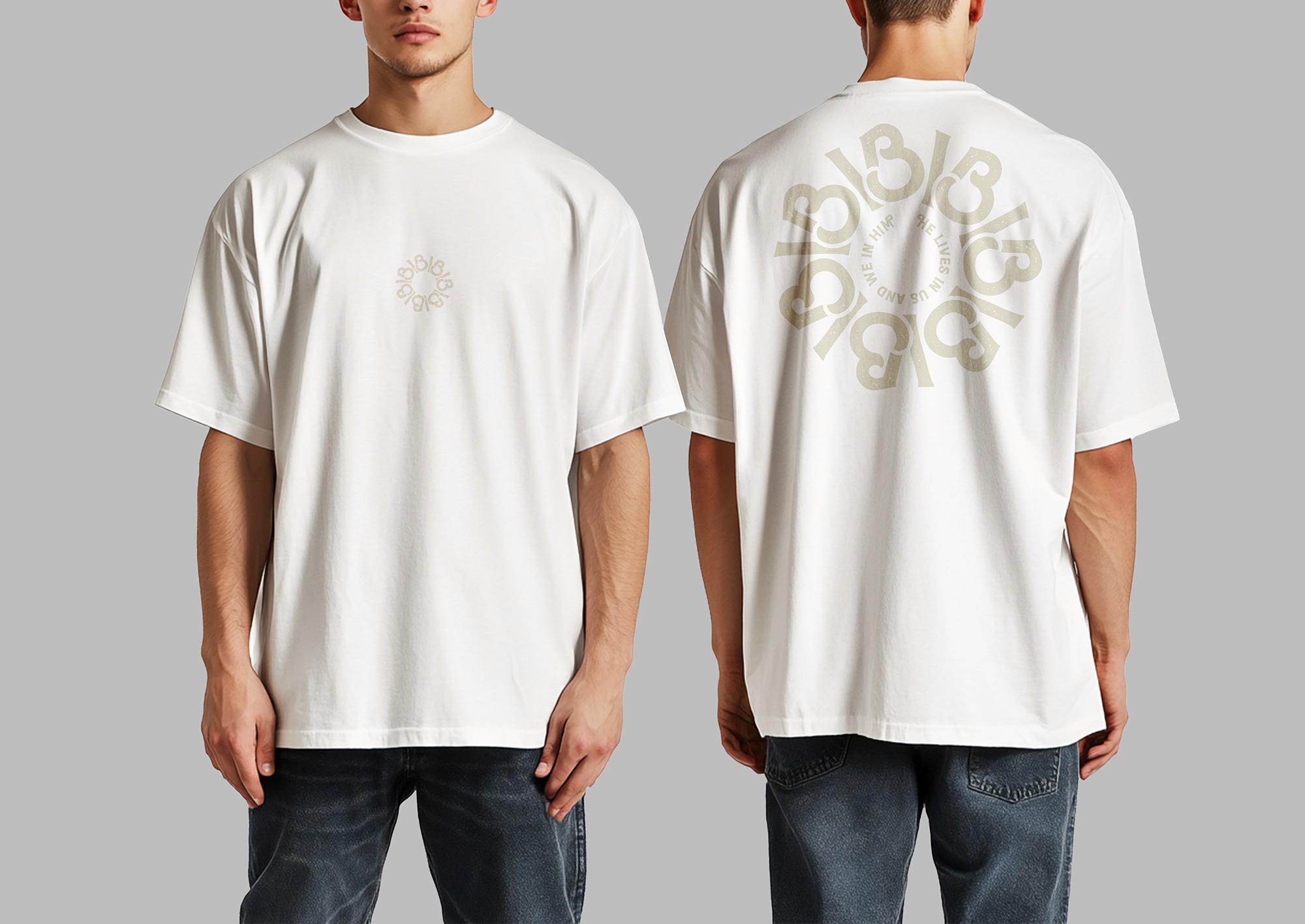
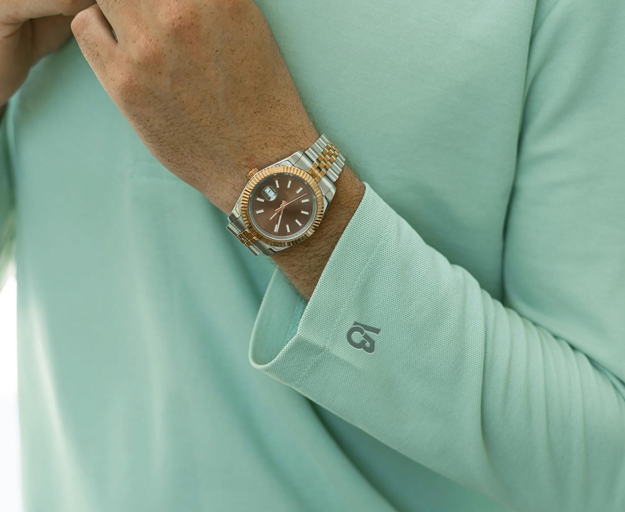

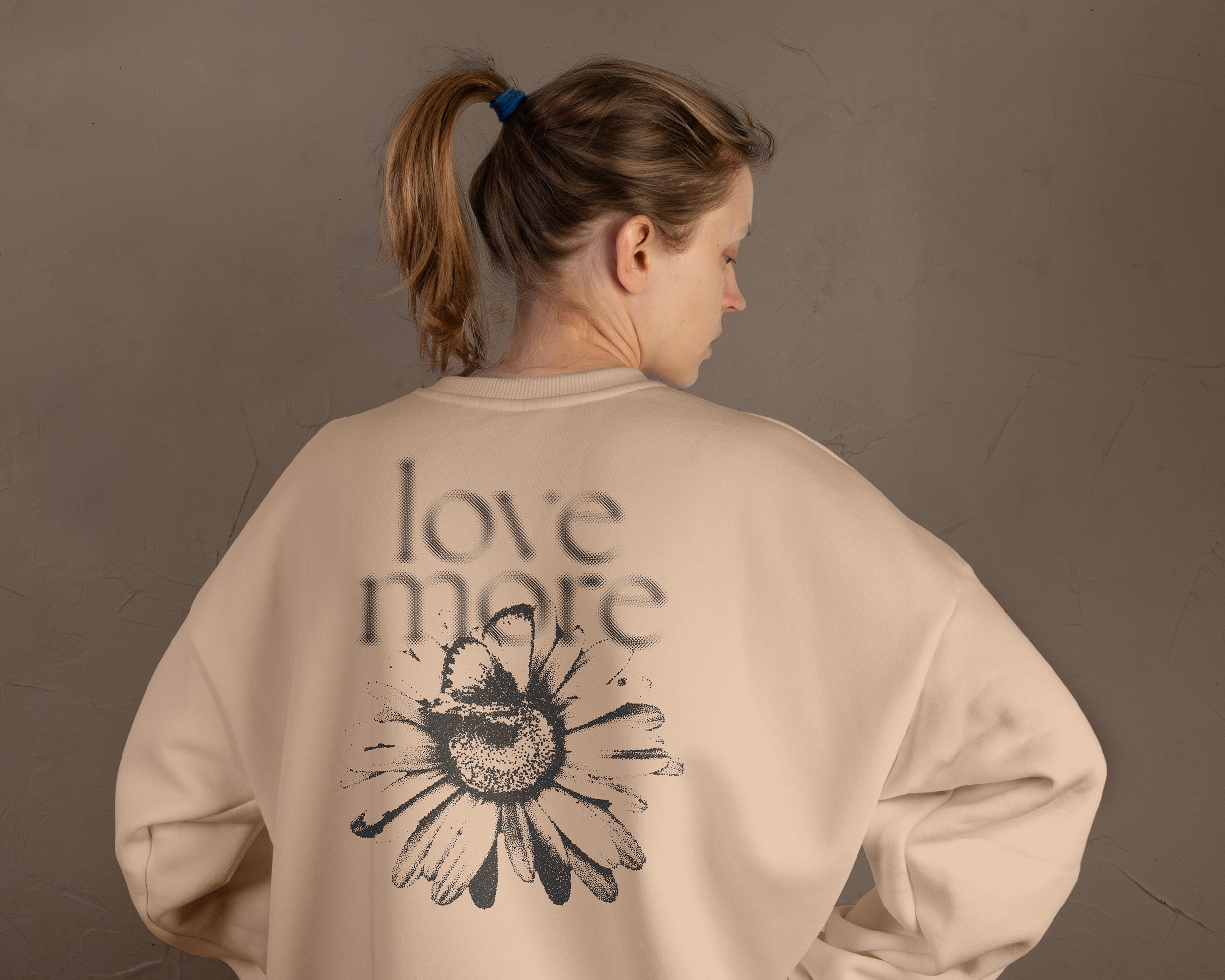
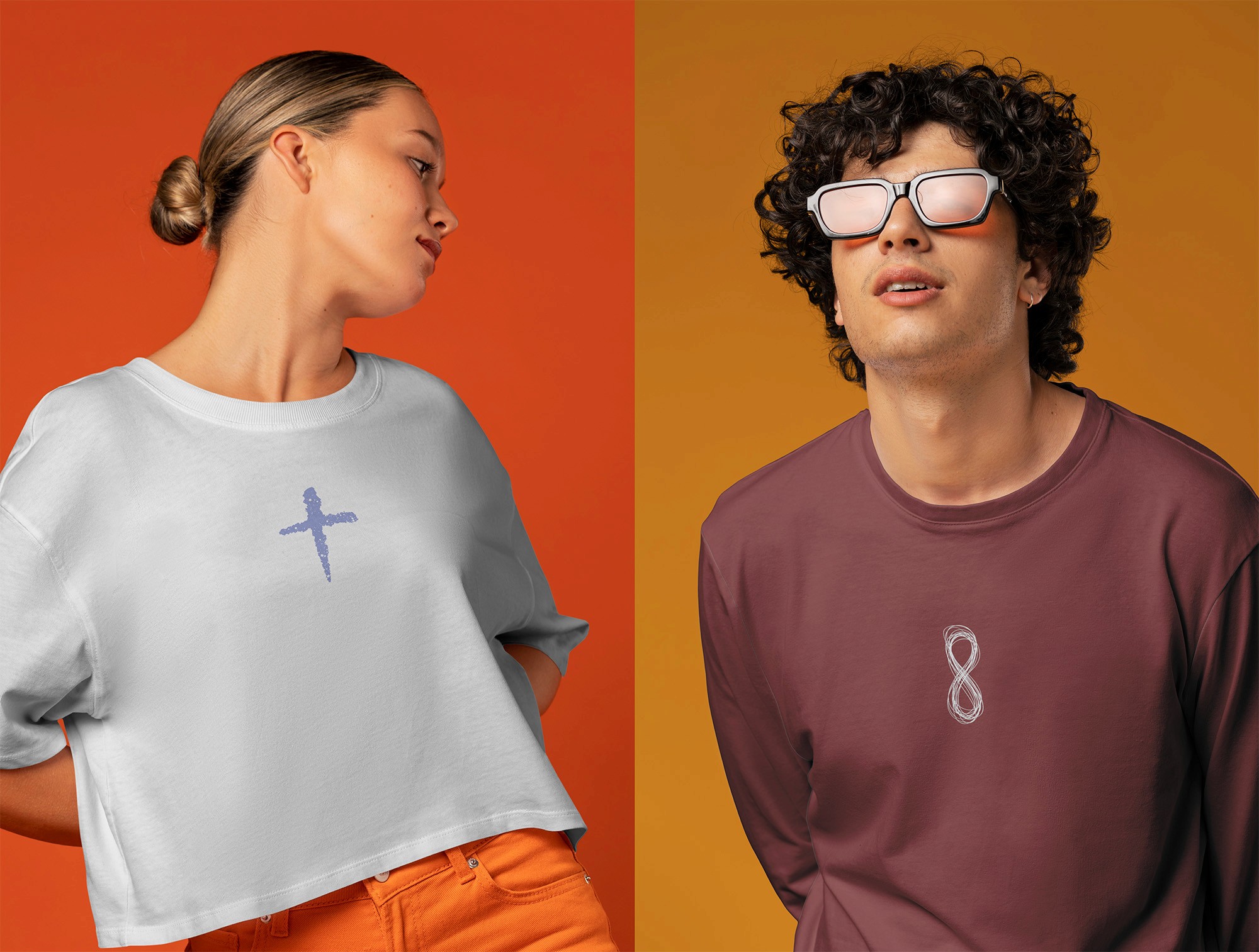

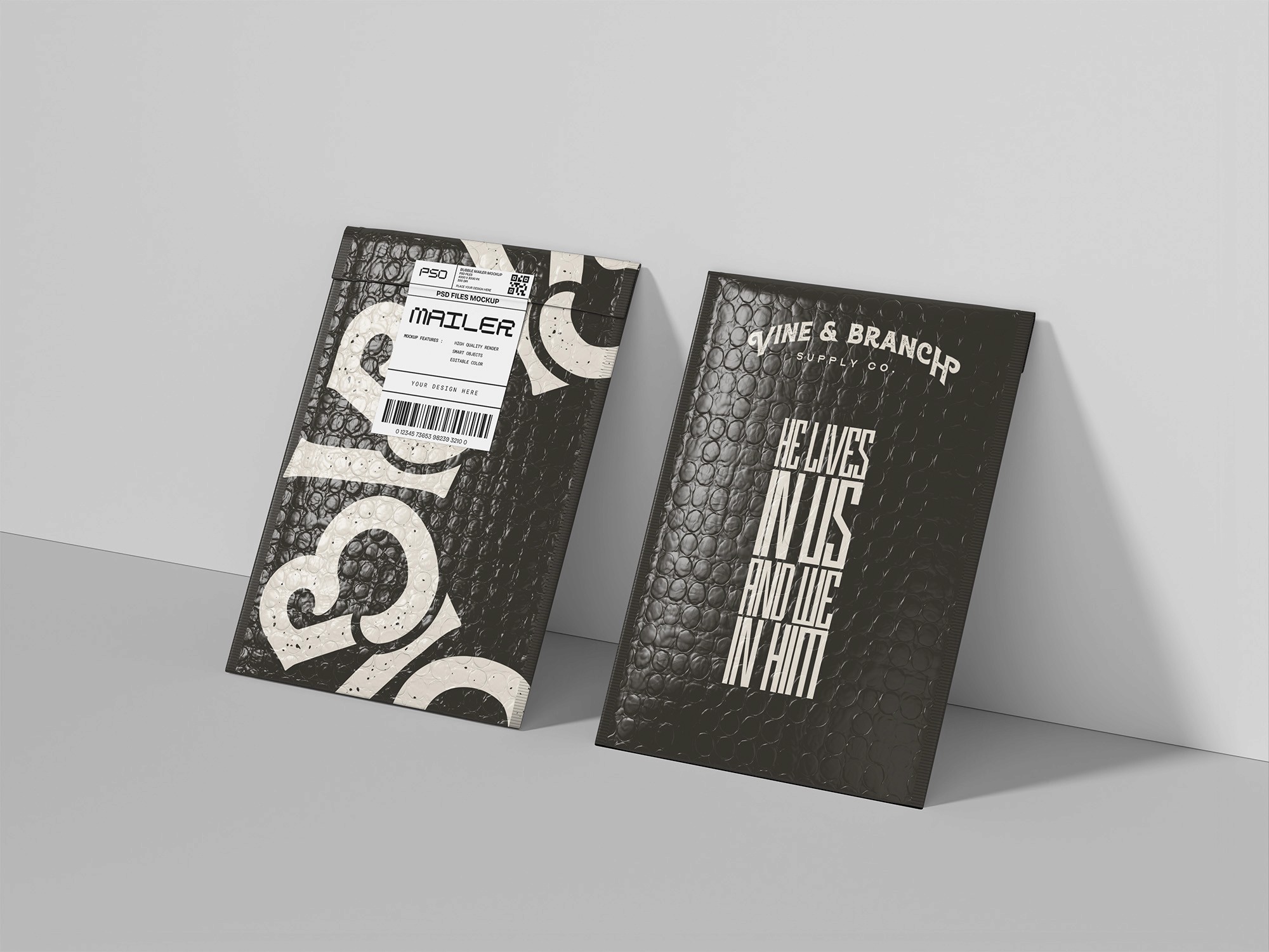
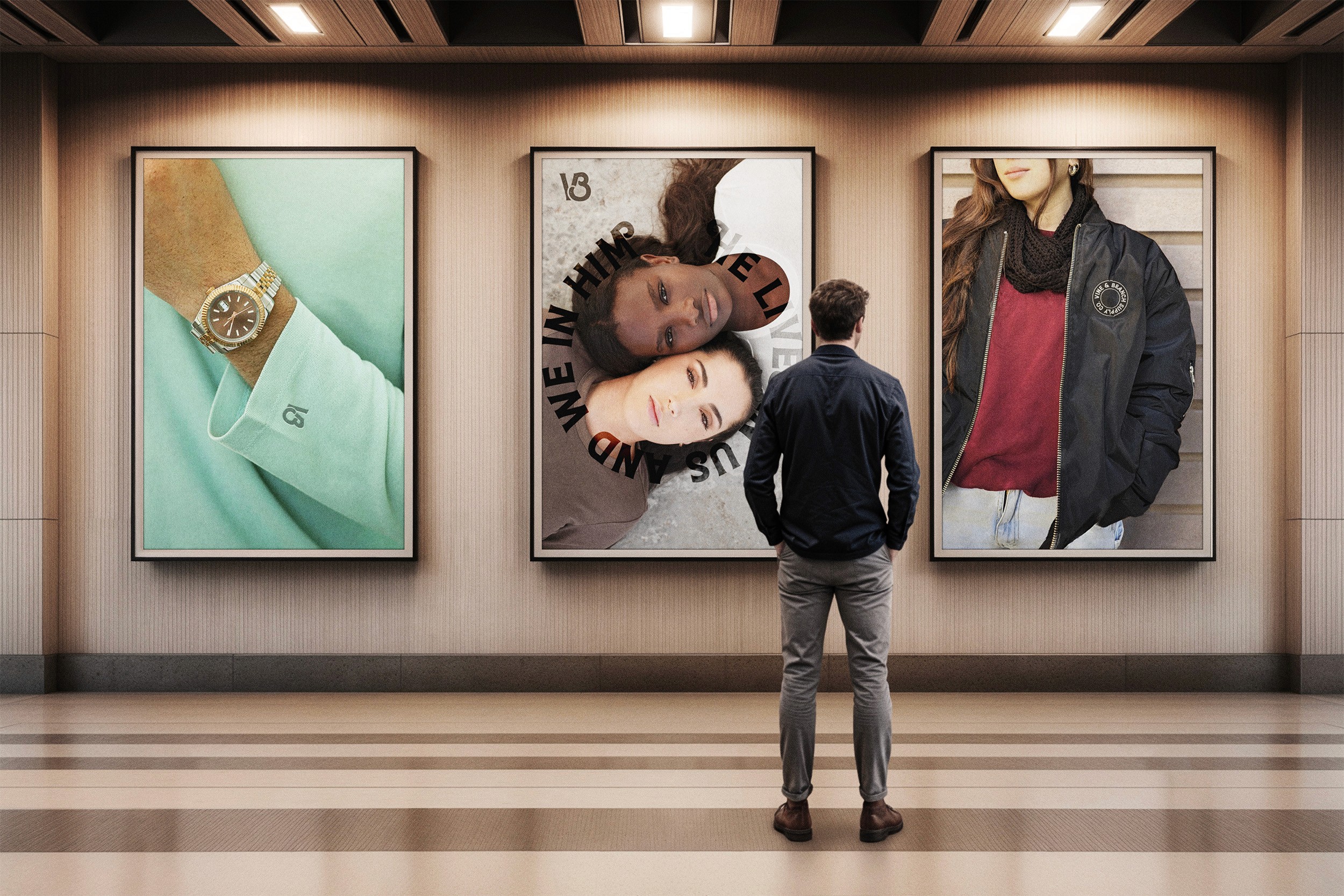
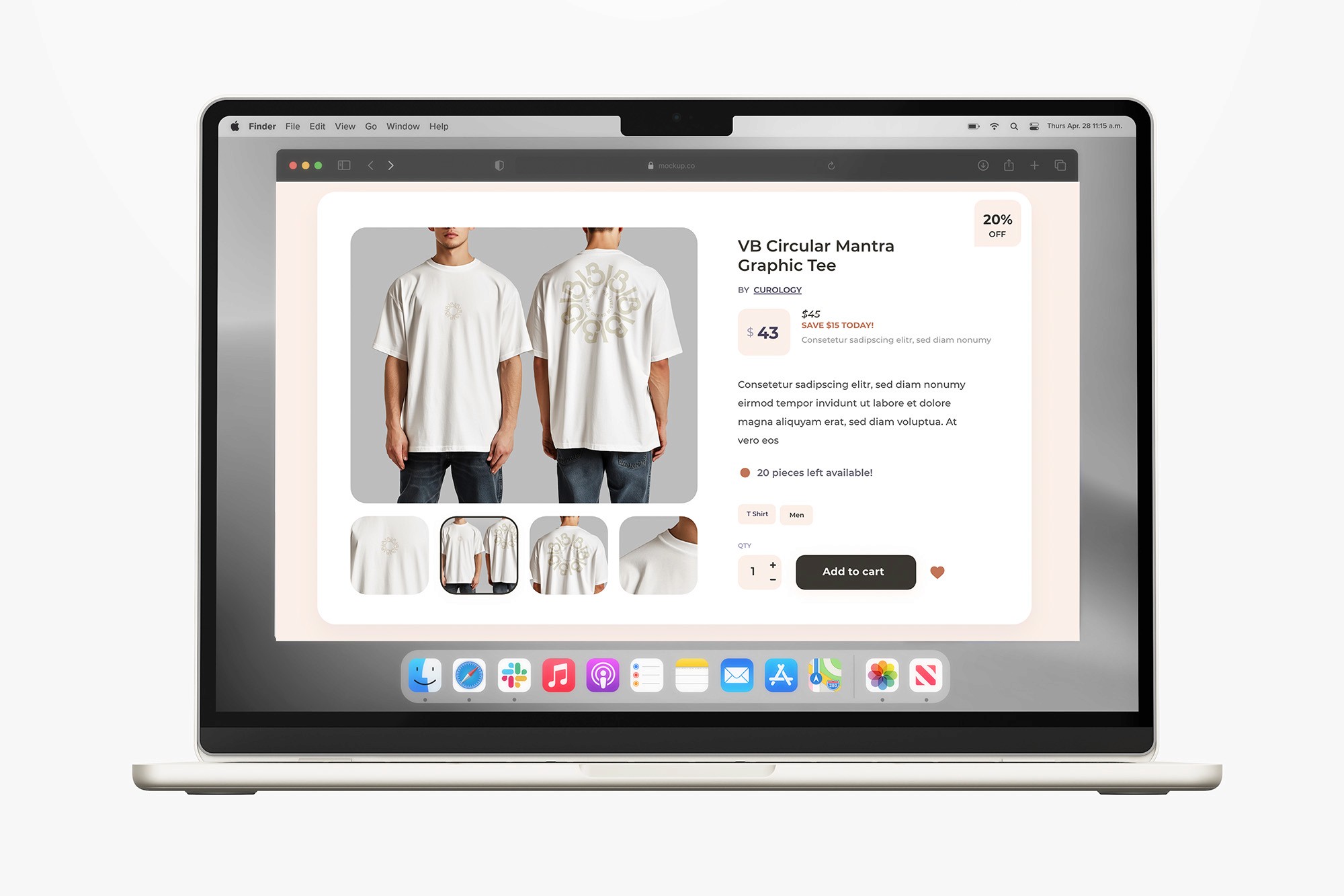
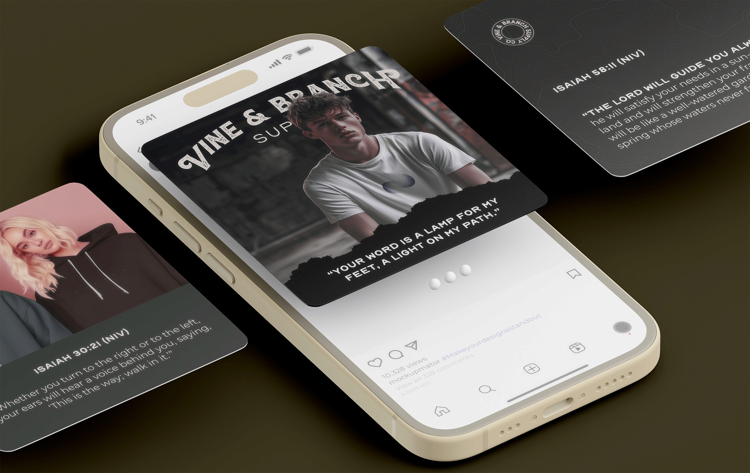
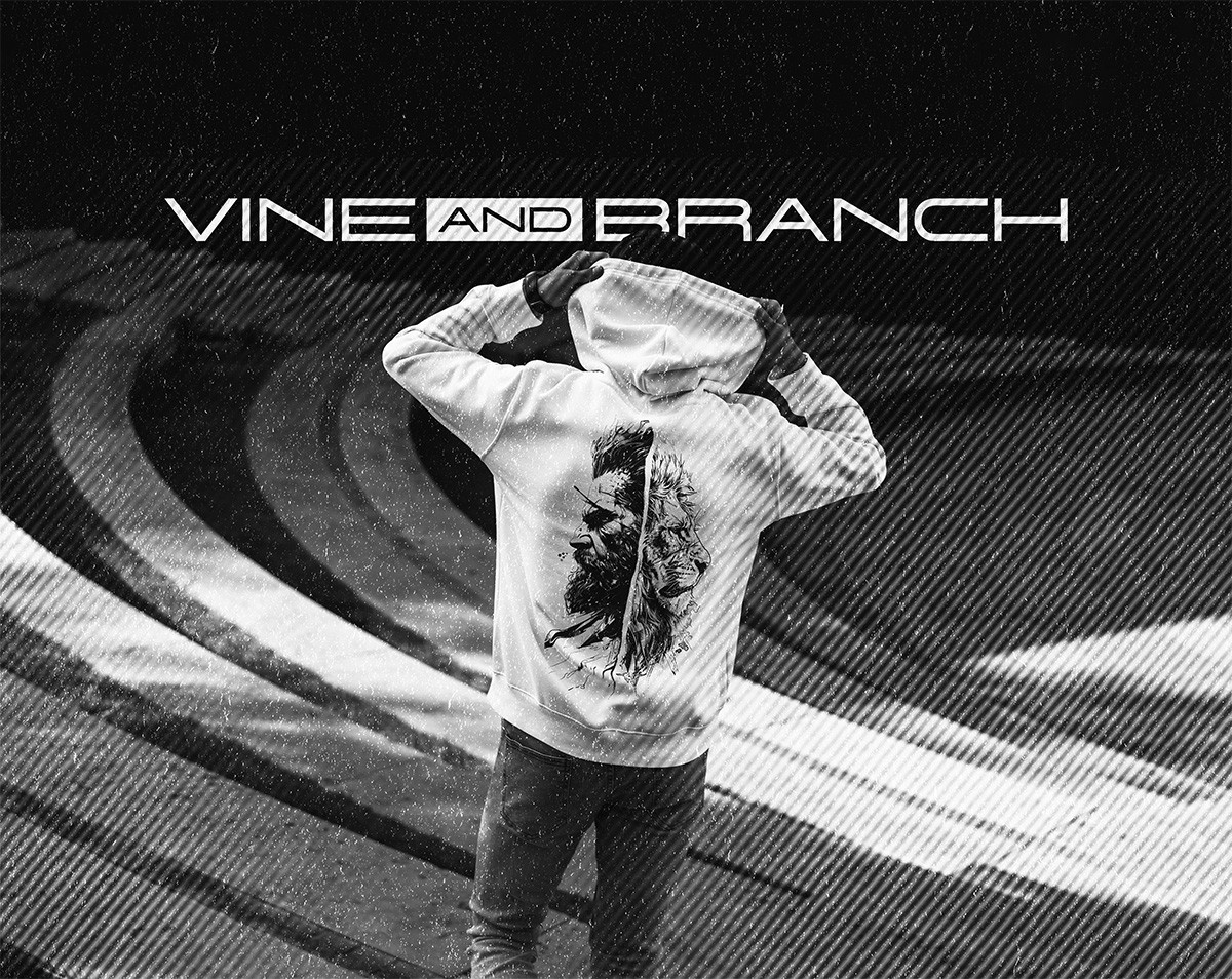
In the Real World